

How I Display Live Data in Rhino Using Conduit
Making this reusable was one of the best things


Last week, I showed you why displaying data alongside your 3D model is so powerful. This week, I’ll show you how I actually set it up.
If you’re on a paid tier, you can skip all the setup and download the template script and model at the bottom.
The way I do this is through something called a HUD, a Heads-Up Display. It’s a 2D overlay on your Rhino viewport that updates as your model changes. You can use it to display legends, labels, titles, really anything you want to show alongside your geometry.
Like most things in Grasshopper, there are a few ways to do this. But my favourite is using Proving Ground’s Conduit UI components.
I’ll be honest, I think this method is more complicated than it needs to be. But it gives you a lot of control and flexibility. And the good news is that once you understand how it works, applying it to other scripts is plug and play. To me, that trade-off of harder to setup but more flexibility is worth it.
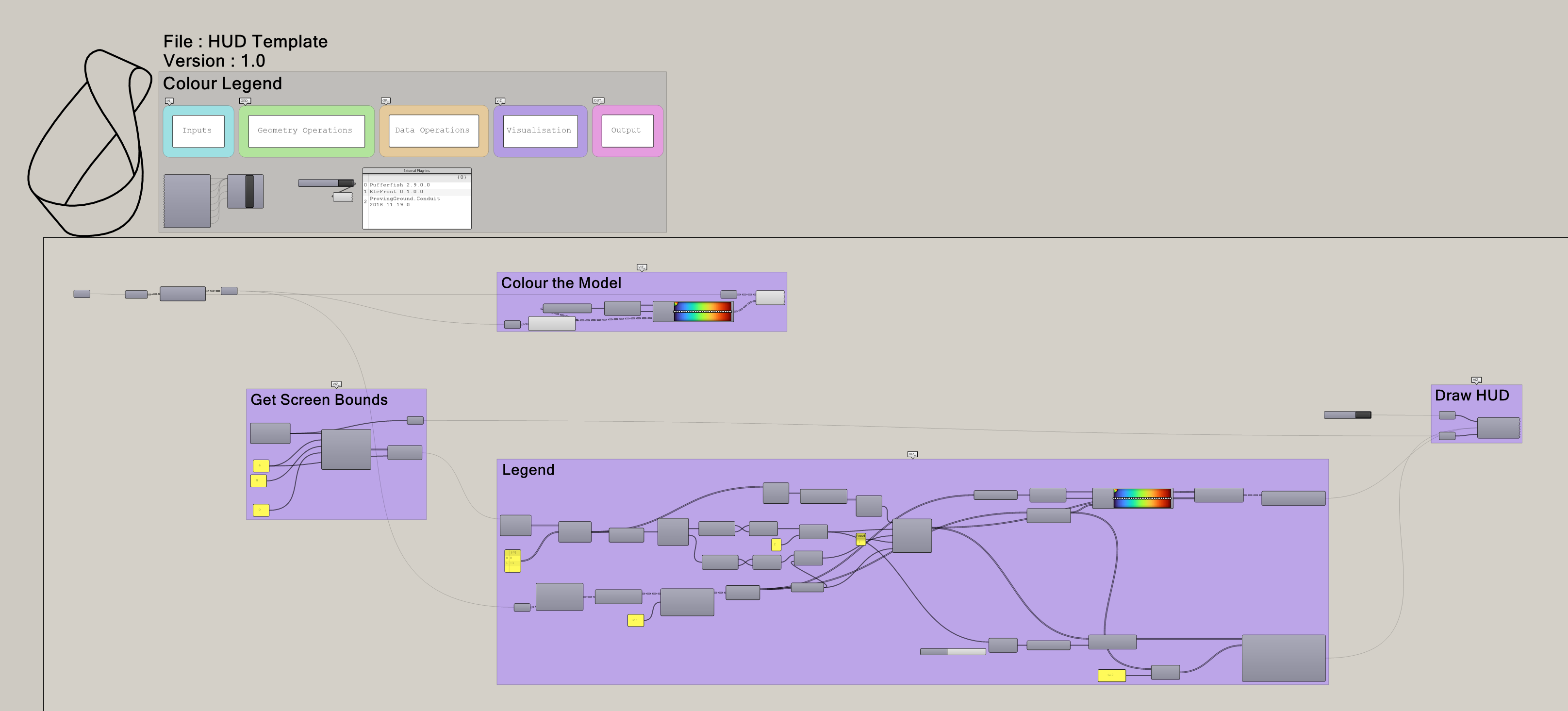
Here’s what the full setup looks like:
You could cluster parts of this, but I found there were too many inputs and the combination of components changes depending on what you want to display. So I keep it out.
How Conduit Thinks
Before we jump into the steps, it helps to understand how Conduit works. It treats your Rhino viewport like a rectangle. And within that rectangle, you can draw any shape or display any text you want. So, total freedom but overwhelming to start.
My approach is to take the entire viewport rectangle, divide it into a grid of cells, then pick the right cells to display the right information. Let’s walk through it.
Step 1: Divide Your Screen
First, we get the bounds of the current Rhino viewport as a rectangle. Then we divide it into cells. Conduit has components to help with this.
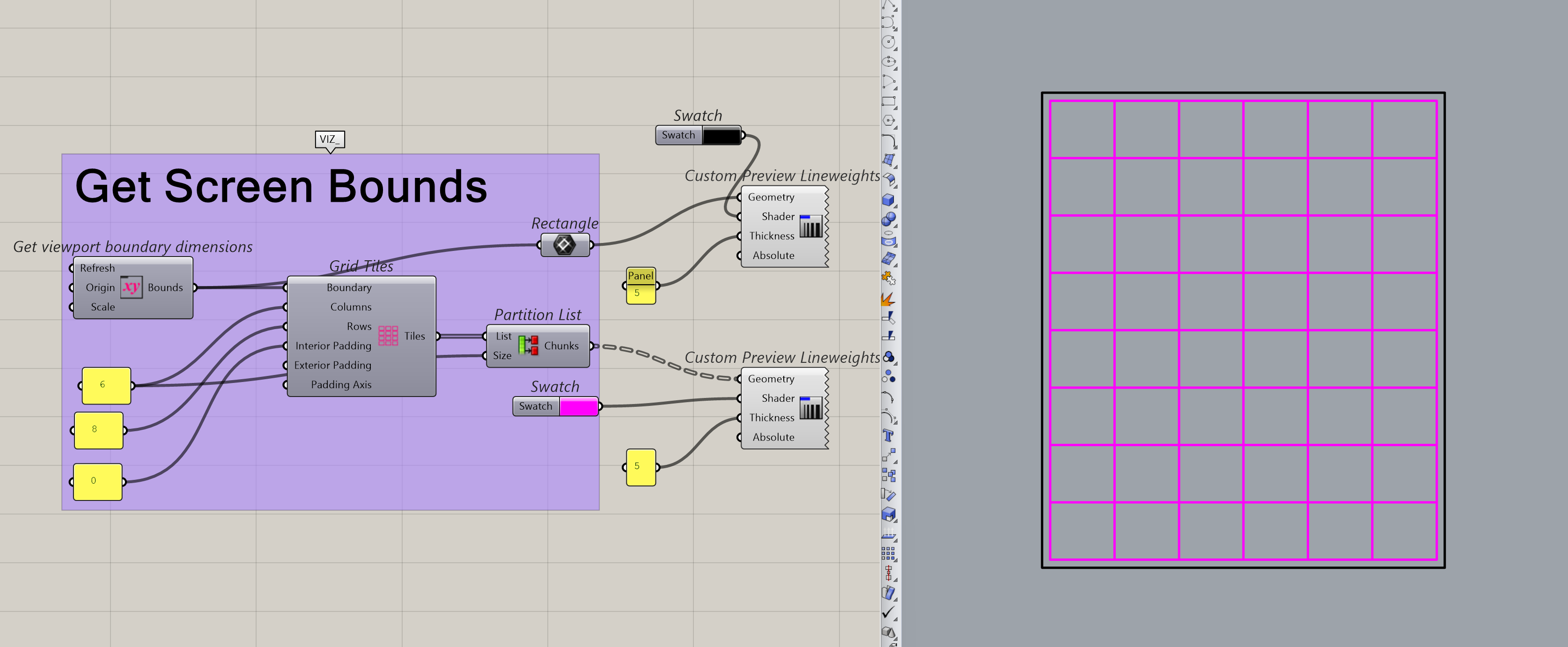
Here, I chose 6 columns and 8 rows because, for a full-screen Rhino view, that’s what looks best to me. But you can change this number because the component actually adapts to the size of your rhino viewport on your screen. So, if your Rhino window is half your screen, you’ll get a more square-ish rectangle which means you can use less rows/columns if you want.
But you can play around with the rows and columns later. I’d suggest following along with my settings first, then tweaking once you’re comfortable.
P.S. you have to refresh the component every time you change the size of your rhino viewport
Step 2: Pick Your Cells
Next, we pick which cells the legend should appear in. These cells represent the locations on your actual Rhino screen. So picking the cells here is actually picking where your legend shows in the rhino viewport. Meta, I know.
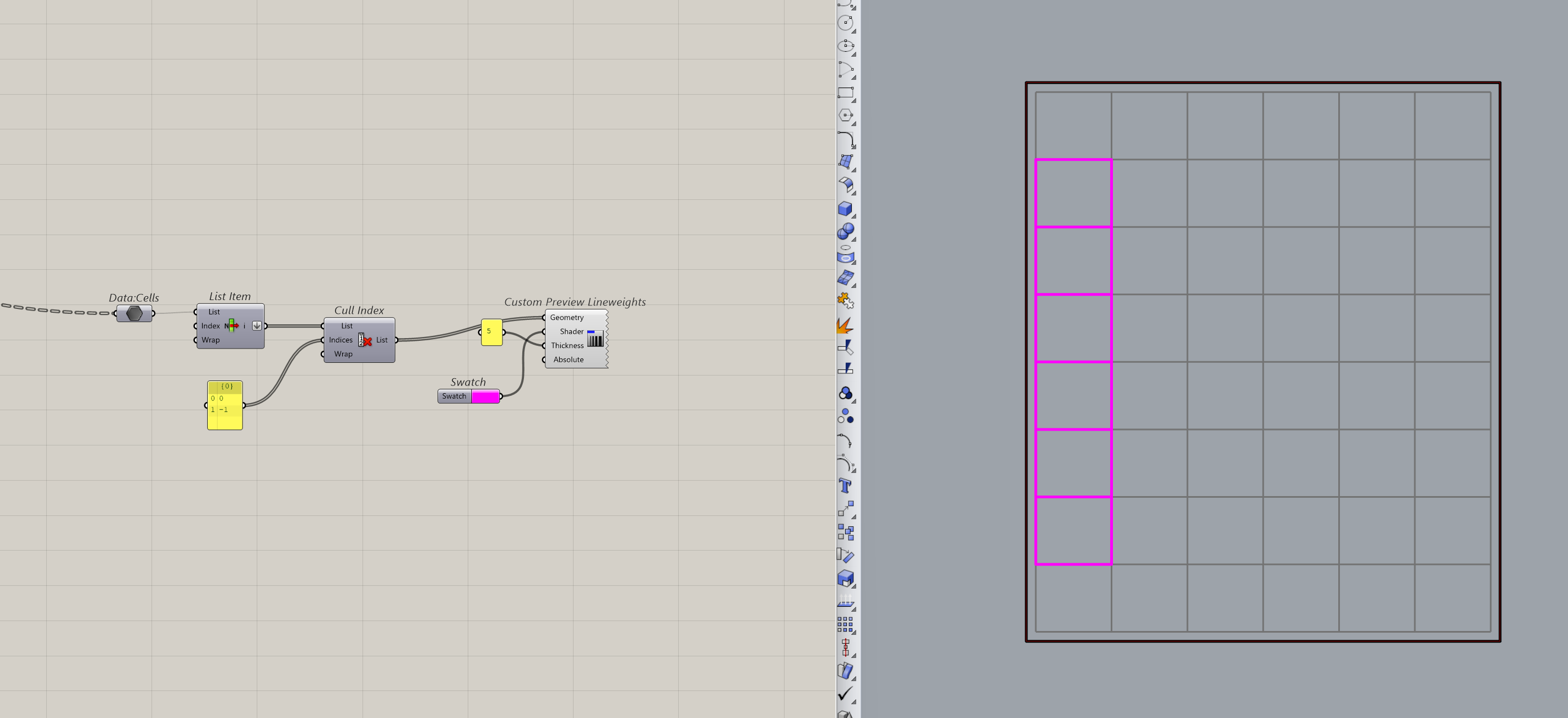
Once we’ve picked our cells, we know the bounds of the legend area. To actually get something to show up there, we need to either create smaller boxes inside these cells (for a segmented legend) or mesh the region (for a continuous one).
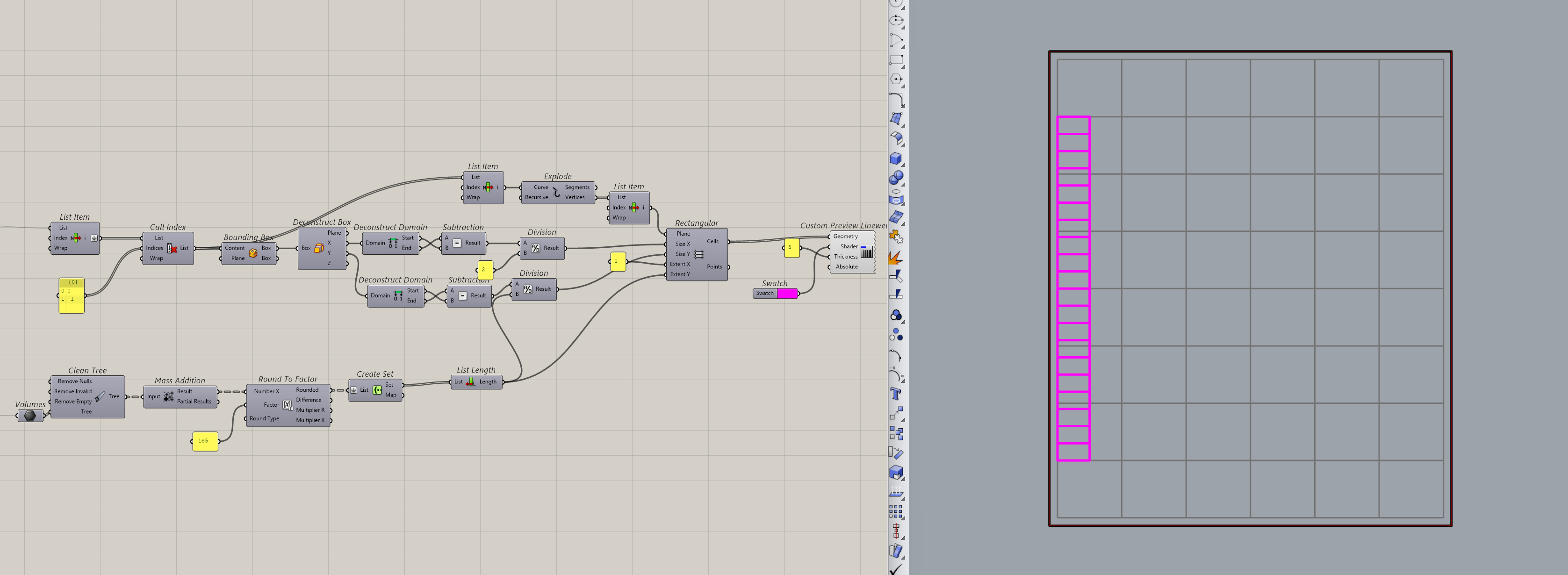
I know it’s a lot to take in, but if you look closely, I’m just taking the bounds of the picked cells and dividing them by the number of values I want to show. I also split the bigger cells in half vertically, which makes room for the text labels on the side.
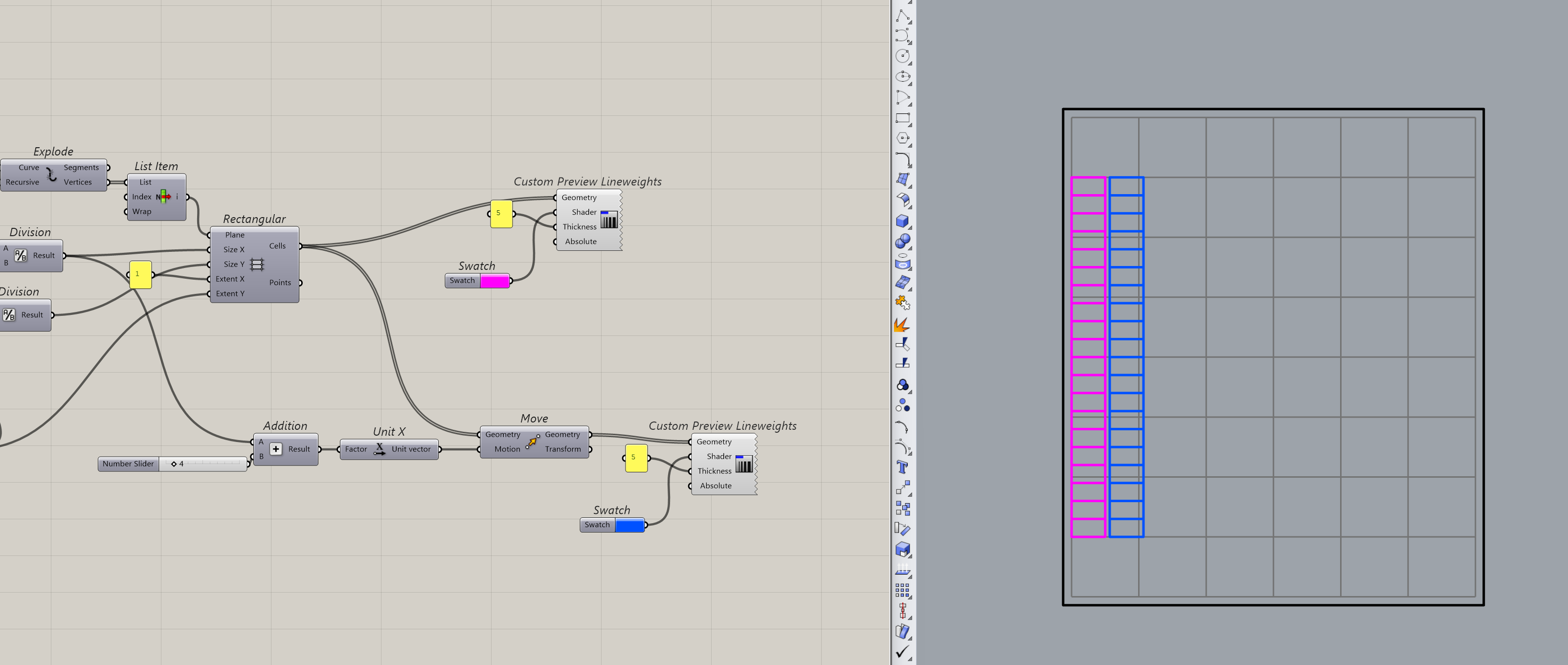
The pink boxes are where the colours will appear. The blue ones are where the text goes.
Step 3: Mesh and Add Text
Okay, that was the hardest part. Once you have these rectangles, you can assign them values and colours to build your legend.
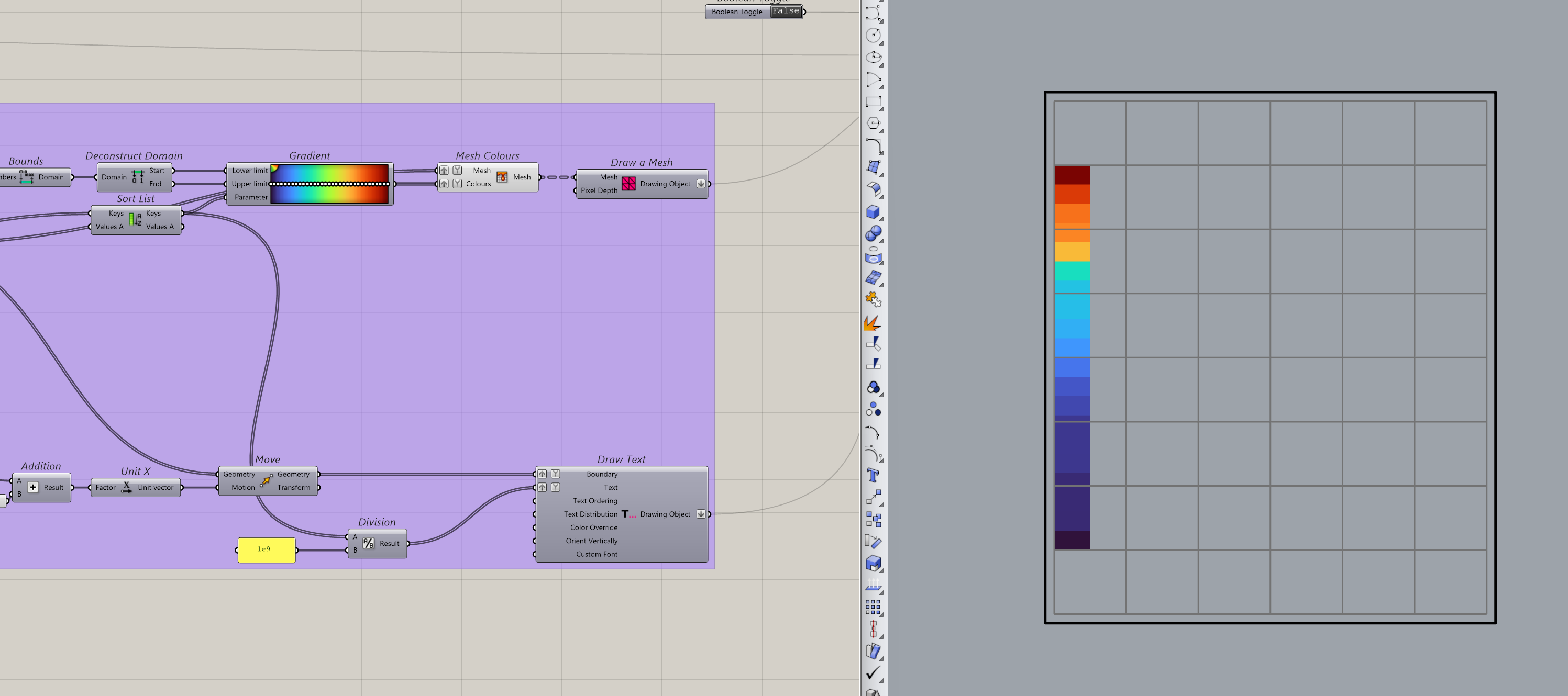
The idea here is straightforward. Each rectangle gets a colour based on the value it represents, and the corresponding text label gets placed in the adjacent cell. Conduit will then handle the rendering.
Step 4: Display It
Then, it’s a simple matter of turning it on.
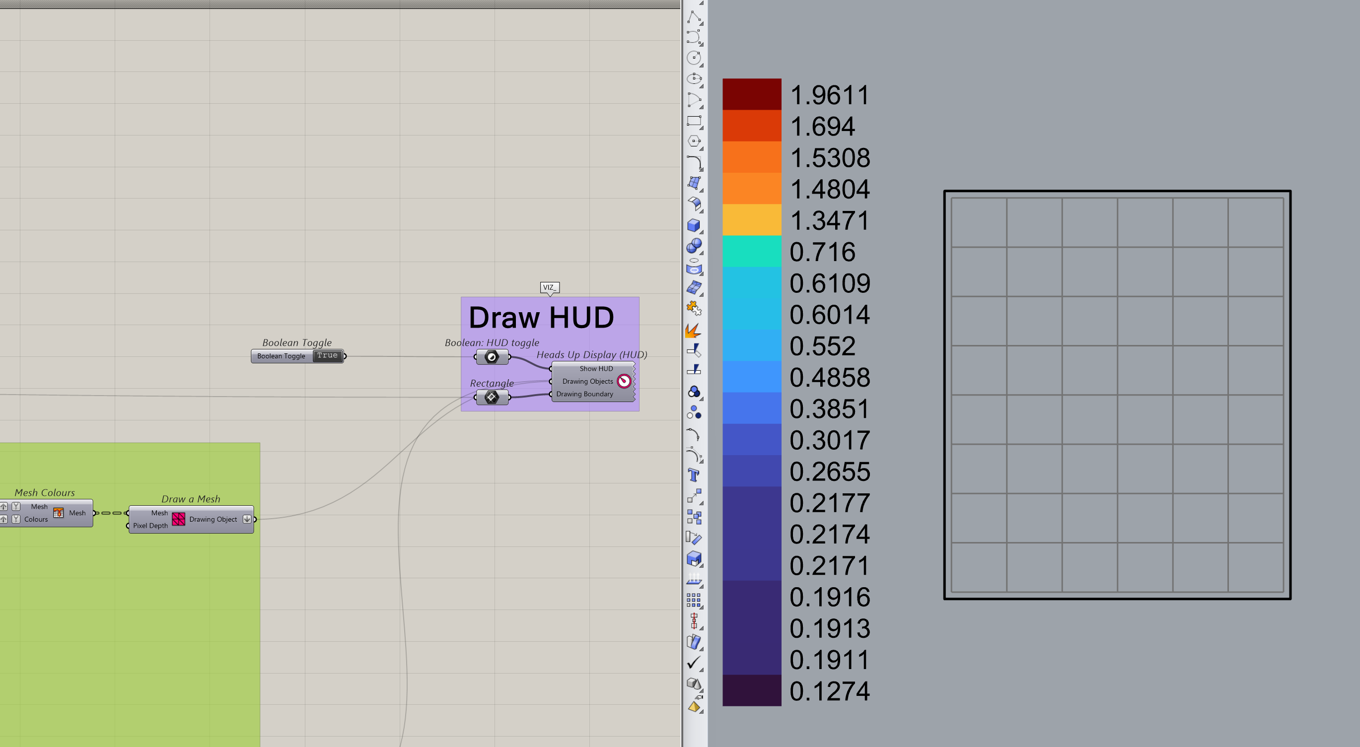
And that’s it for the basic setup.
From here, you can tweak it as much as you like. Make the legend wider or taller by changing your picked cells. Add a title by choosing a cell above the legend and displaying text in it. Select a row instead of a column and
make a horizontal legend. You have full control over where things go and how they look.
Why This Is Worth the Setup
I won’t pretend this is quick to set up the first time. It took me a while to get comfortable with how Conduit maps everything to the viewport. But once I had a working setup, I never had to build it from scratch again.
Every new script, I copy these components in, swap out the colours and values, and I’m done. If I have to add / remove anything, I already have the base components to work of. Making this set of components reusable was one of the best investments I made in my Grasshopper workflow. And I hope it saves you the same amount of time.
Get the Script
Drop these components into any Grasshopper script and you’ll have a working HUD without the setup. Just swap out the colours and values for your project. If you want to further tweak it, I have also included a sample model to show you exactly how I coloured my model.
